0.0 Challenges & Client Goals
The original website lacked a cohesive design system, leading to inconsistencies across pages and an unclear typographic hierarchy. Additionally, the use of Wix as the development platform imposed limitations on implementing custom features and scaling functionality.
From a design perspective, the client’s top priority was to incorporate interactive animations on the homepage that could engage users. They also emphasized the importance of consistently reflecting their brand values—vibrancy and trust—through a professional and cohesive visual design.
On the development side, the client wanted a long-term content management solution that would allow them to easily update and maintain the website. Enabling a seamless purchasing experience was a key priority—they wanted users to be able to intuitively explore and purchase their programs without friction. Additionally, they needed an efficient system for managing members and their purchased programs.
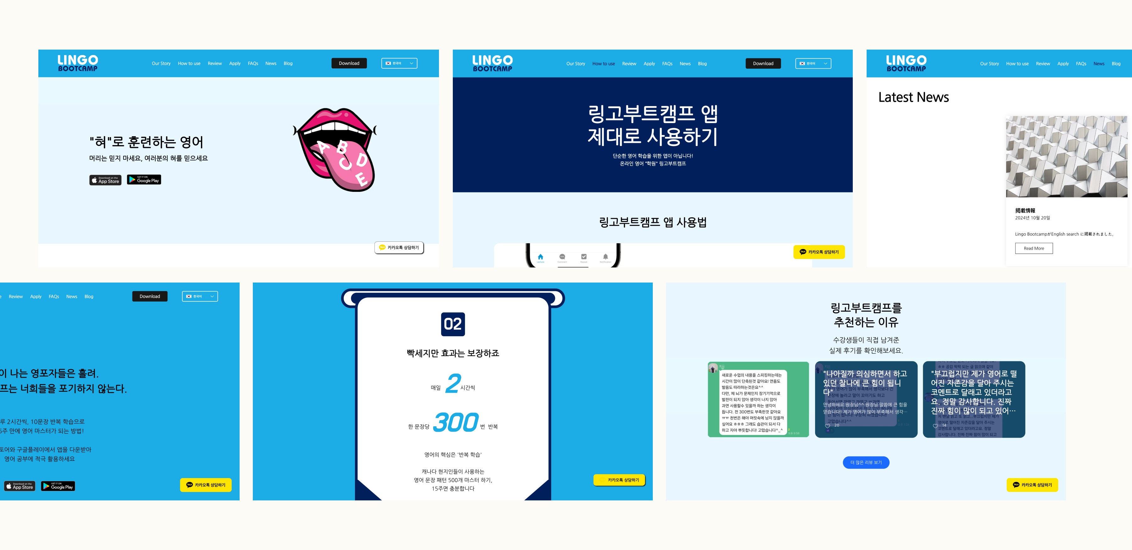
[ → Screenshots of Original Website ]
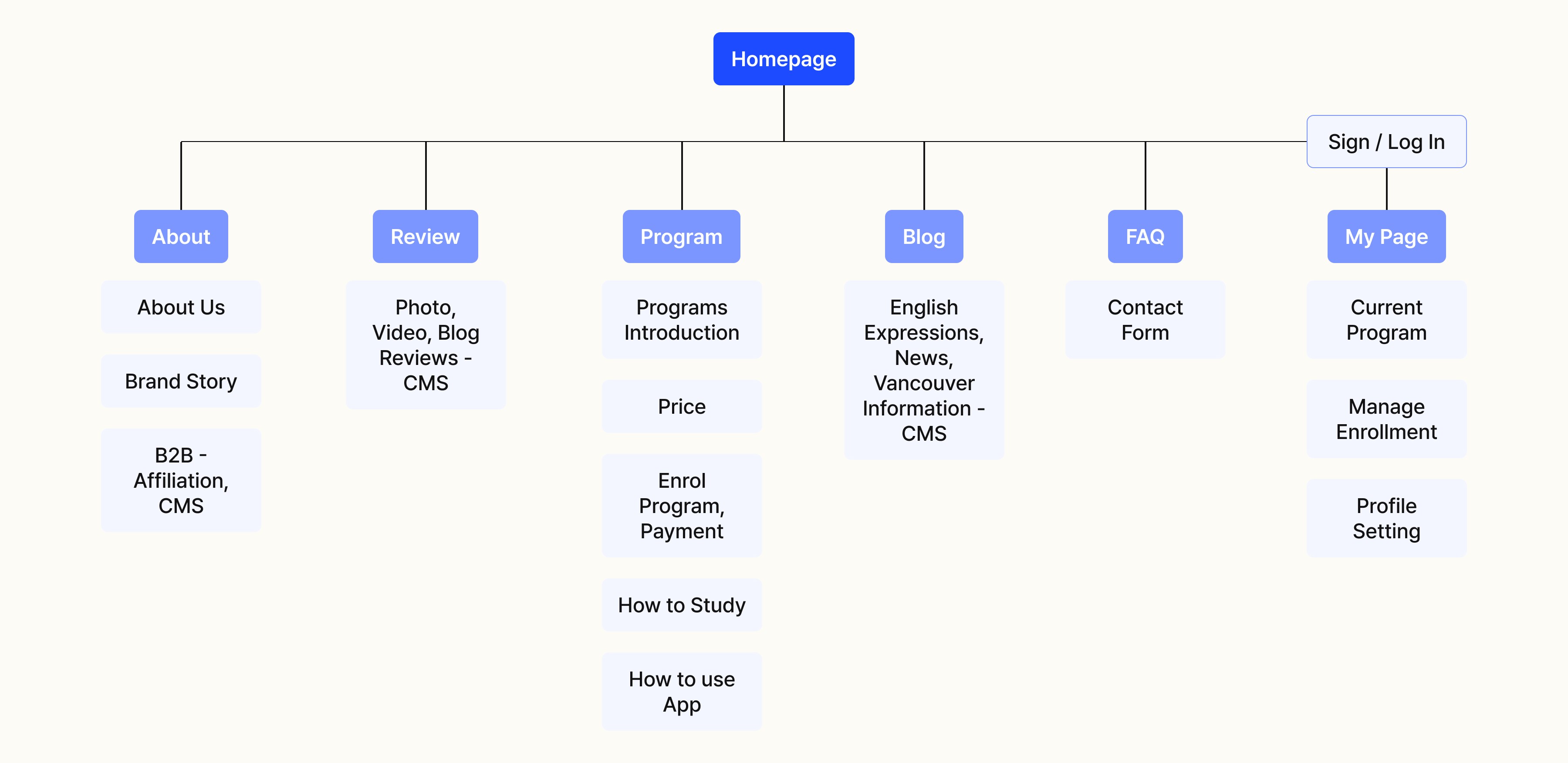
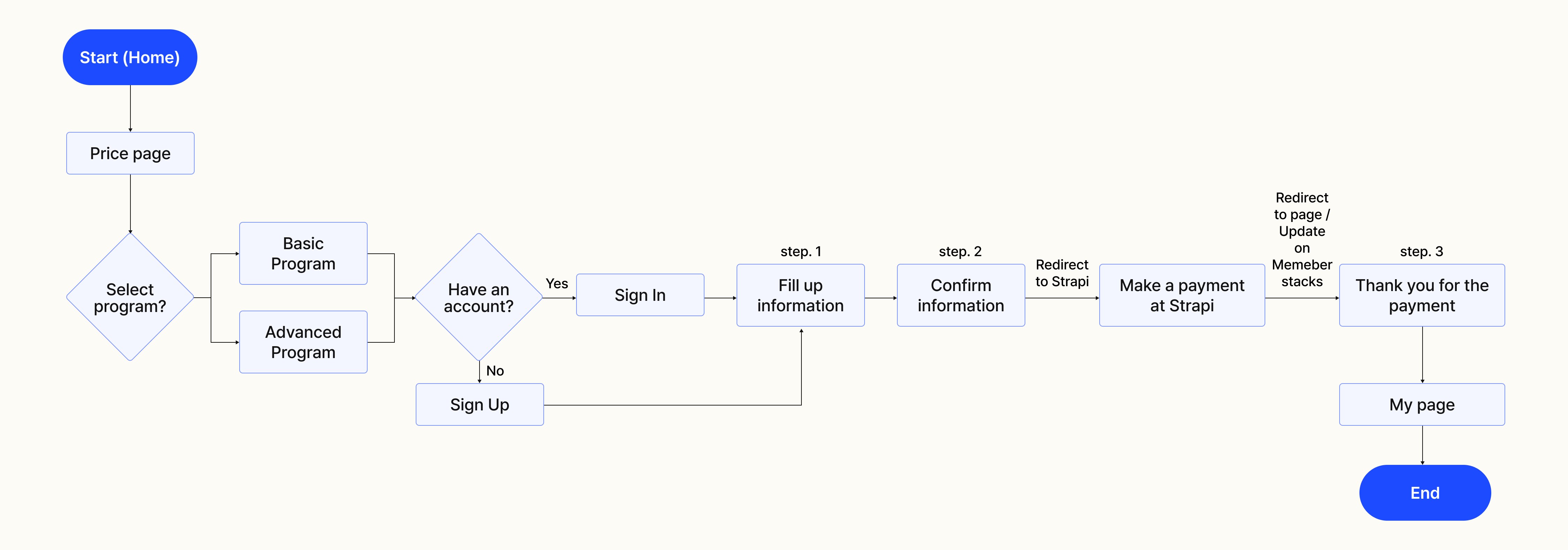
1.1 Information Architecture & User Flow
To effectively present the information the client prioritized, I organized the site content through a clear information architecture. The most critical feature—the payment process—involved both Strapi for handling purchases and Memberstack for updating user data on the backend. To ensure a seamless experience, I broke down the flow into clear, guided steps that would help users navigate the process with ease.
[ → Information Architecture for Lingo Bootcamp Website ]
[ → User Flow for Payment Process ]
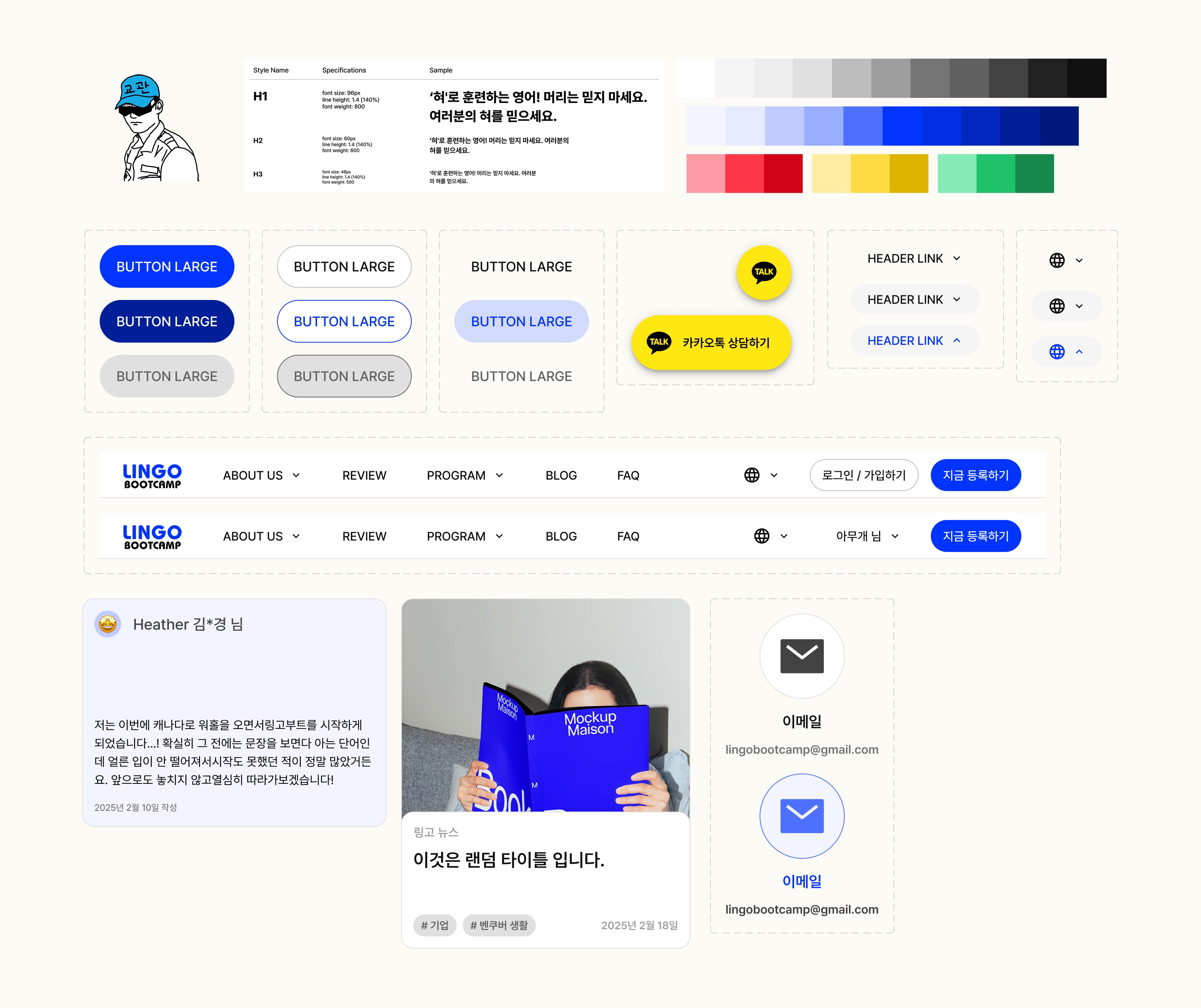
1.2 Creating a Design System & Components
To visually reflect the client’s core values of vibrancy and trust, I developed a color theme centered around a bright blue palette. Since the client wanted to support multilingual feature, I built the typographic hierarchy using the Pretendard font, which offers strong multilingual support—ensuring visual consistency across all languages.
Additionally, I created reusable components along with appropriate variants to streamline development and maintain design consistency throughout the site.
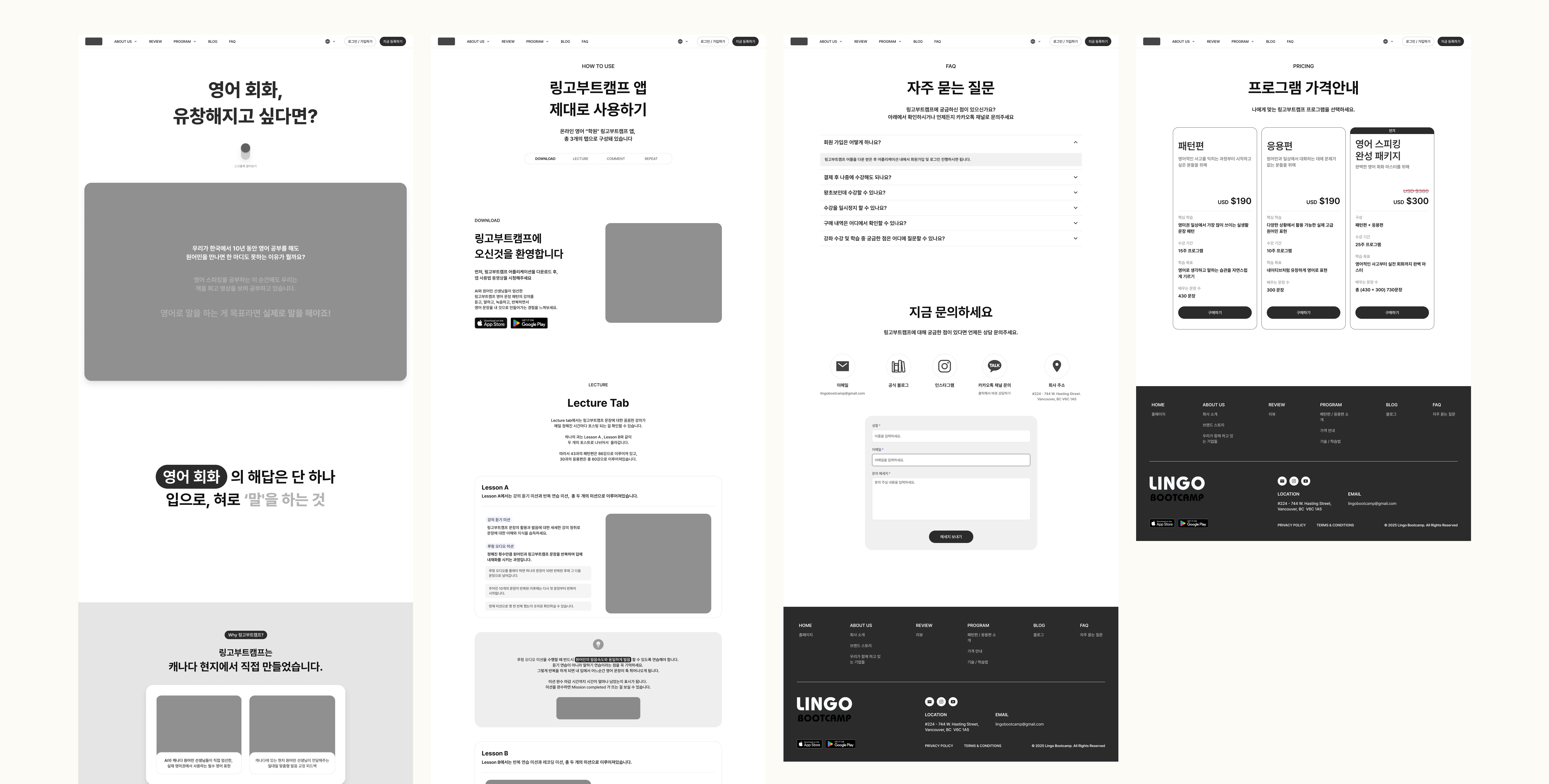
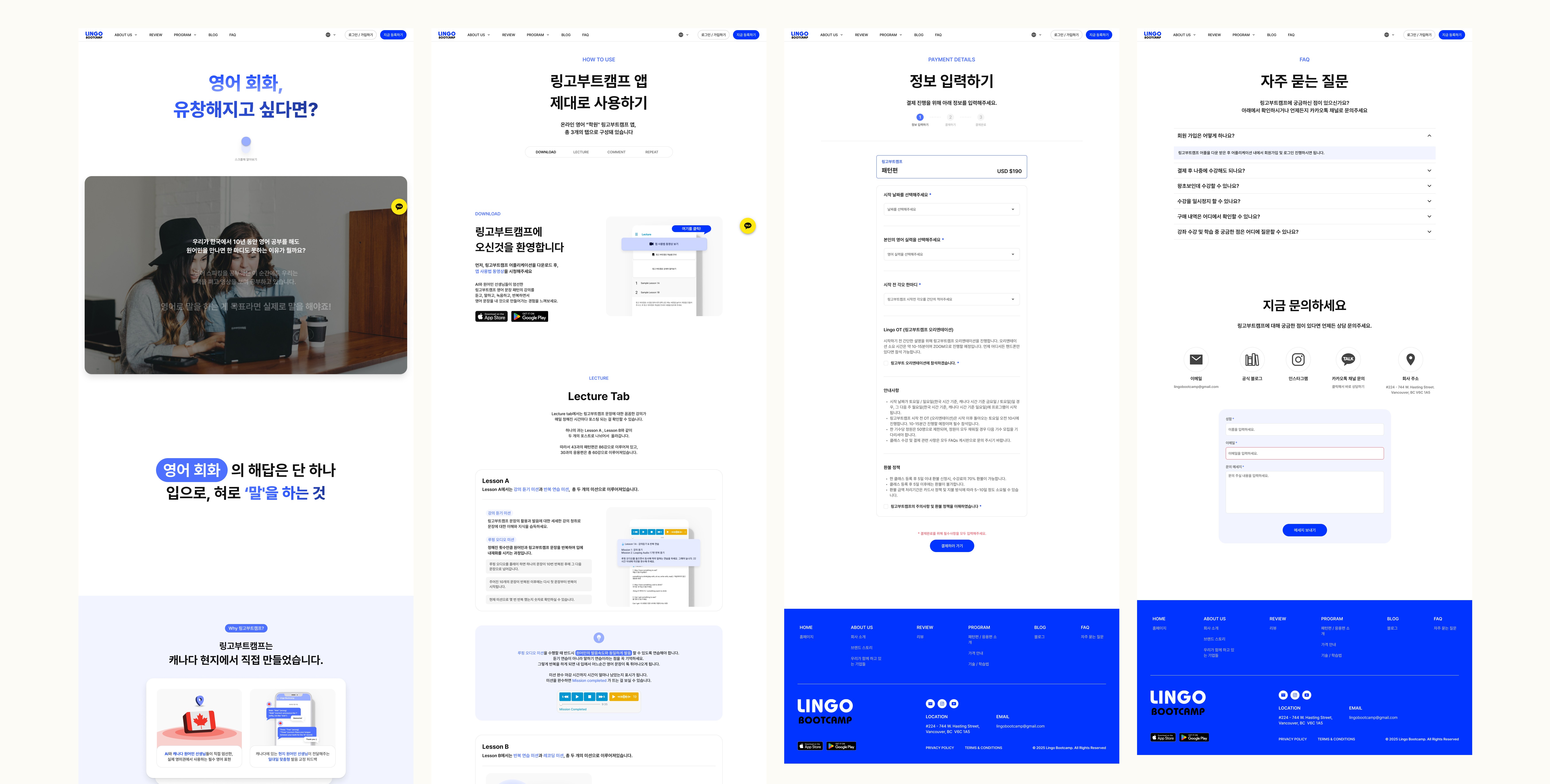
2.0 Wireframes & Prototyping
To communicate and present design ideas efficiently, I used Figma to create wireframes that guided our iterative discussions with the client. For the interactive animations they requested, I built partial Figma prototypes to visually demonstrate how these elements would be implemented across key sections. This helped us align on expectations early and overcome time constraints, while still achieving the desired level of visual engagement.
[ → Low-fidelity Wireframes ]
[ → Hi-fidelity Wireframes ]
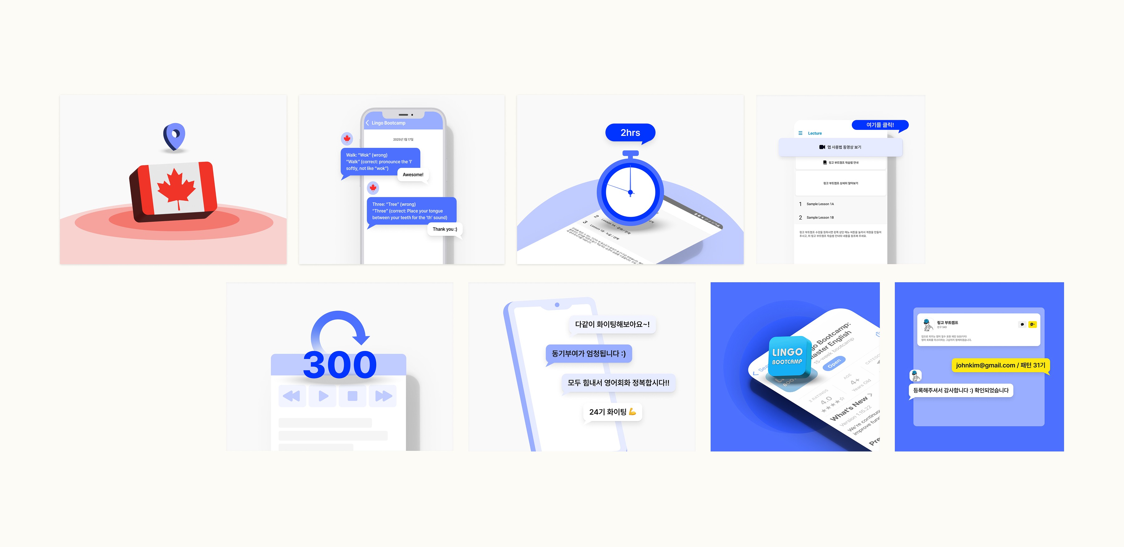
3.1 Creating and Optimizing Graphic Assets
I created all graphic assets using Illustrator and Figma, ensuring that each element aligned with the established visual identity. For the motion animations, I leveraged Lottie to optimize performance and reduce file sizes without compromising on quality, making the animations lightweight and fast-loading across all devices.
3.2 Developing with Webflow
For the development phase, we used Webflow to build the website, ensuring a seamless transition from design to implementation while maintaining responsive layouts and interactions. Continuous feedback and testing allowed for fine-tuning and refining the site to meet both design and functionality goals.
[ Let's Talk ]
© JEN KIM 2025